
This is gonna be one of those posts that might sound like a big fuss about nothing to some people, so if you’re not bothered about Insta shots and putting much thoughts into photo editing, then this post probably isn’t for you. Just putting that out there! Us bloggers can be pretty invested in this stuff, ok. Well aware of how ridiculous it may seem to some, but for those of you who are interested (which was the majority, according to a lil’ poll I ran on Insta), here ya go. Recently I switched up my photo editing and have *finally* found a style I enjoy and feel like I can stick to, so obviously I’m gonna ramble about it on here.
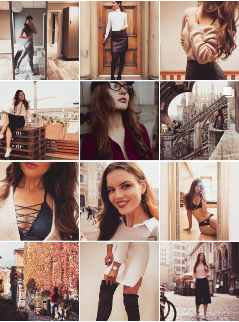
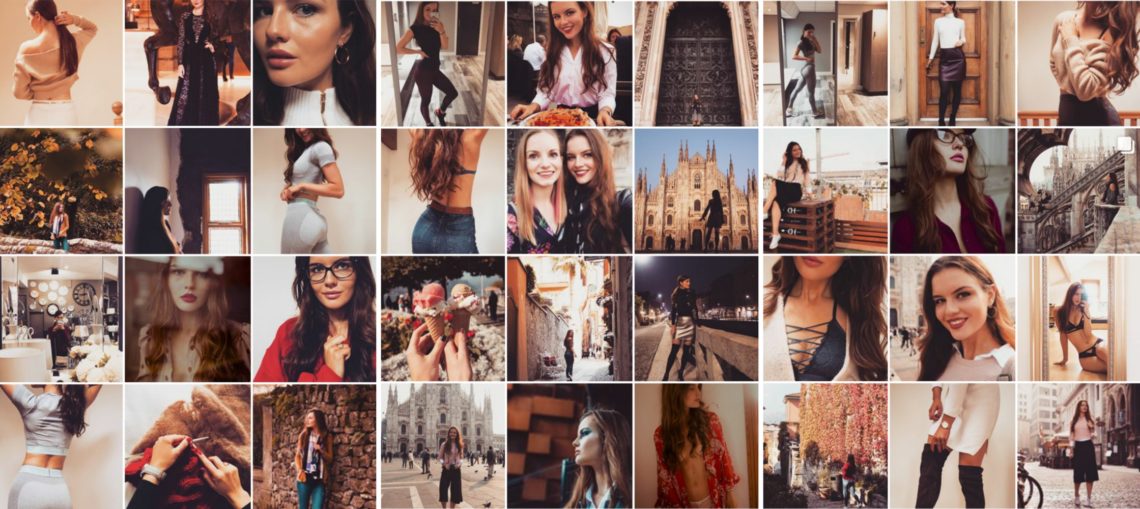
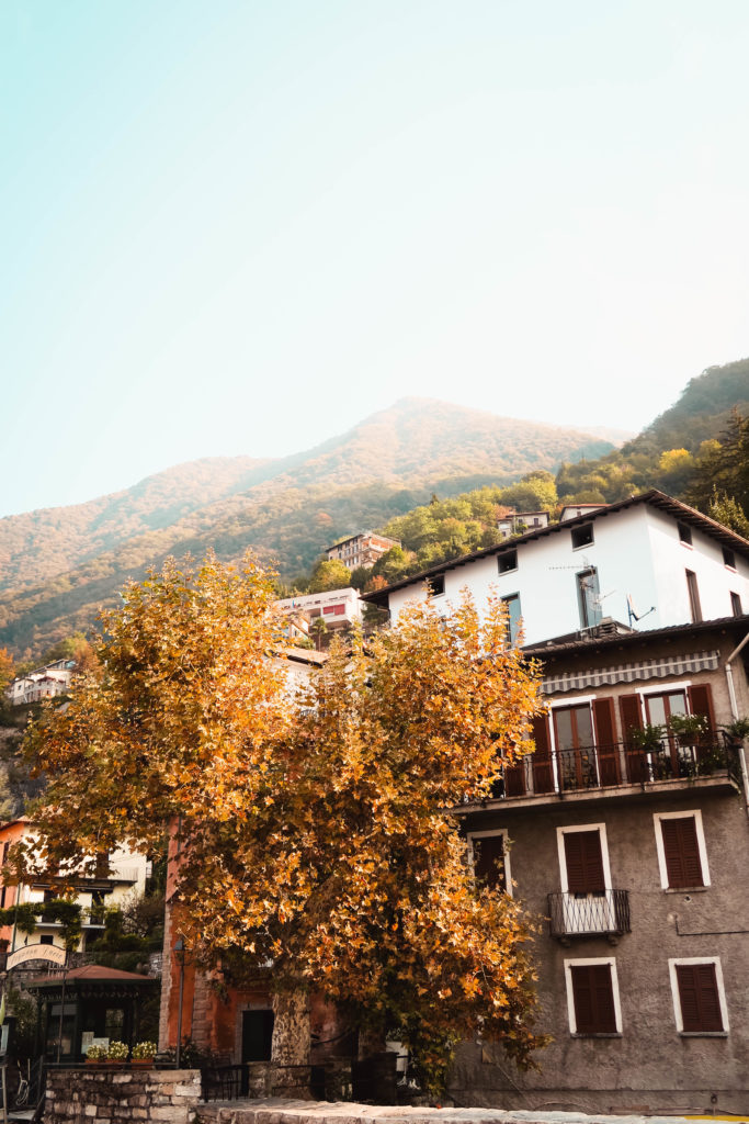
Here are ma photos. Hope you like.
Just a note – by ‘editing’ I mean purely lighting, tones, and that kind of thing – I’m not interested in changing my body shape, and have never even downloaded Facetune. The clone tool is only ever used to abolish a rogue crisp packet or cigarette stub that nobody needs to see!
The main thing I’ve changed is ditching photoshop on my laptop and VSCO on my phone, and swapping them for Lightroom on both. And tbh, I have no idea why it’s taken me so long. SO MUCH BETTER (and quicker on my laptop, too). Whilst obviously Lightroom for laptop/desktop isn’t free, the app is, so I have no idea why I don’t hear more people talk about using it. Either that or I’m living in an app free bubble, which is pretty unlikely. Anyway, I pretty much felt like I’d stumbled across the holy grail when I realised the app was free, so there ya go.
Most photo editing apps – Snapseed in particular – have pretty decent lighting editing functions, but what gives Lightroom the edge (IMO) is the fact that you can tweak the hue, saturation and luminance of each colour individually, in addition to split toning and more control over curves. Gives you the ability to create your own filters, basically. Yay for that! Yay for another way to ~productively~ procrastinate!
So, once I’d established that I was gonna sack pre-made filters, I set about creating one that would always work for me. Was just pretty fed up of my photos looking like a jumbled mess on my blog and Instagram tbh.  And so began the process of elimination in deciding what wasn’t going to work for me, and seeing what was left. Gawd I’m making this sound far more dramatic than it is. Fellow bloggers, you feel me, yeah? Photos that go together are way too satisfying.
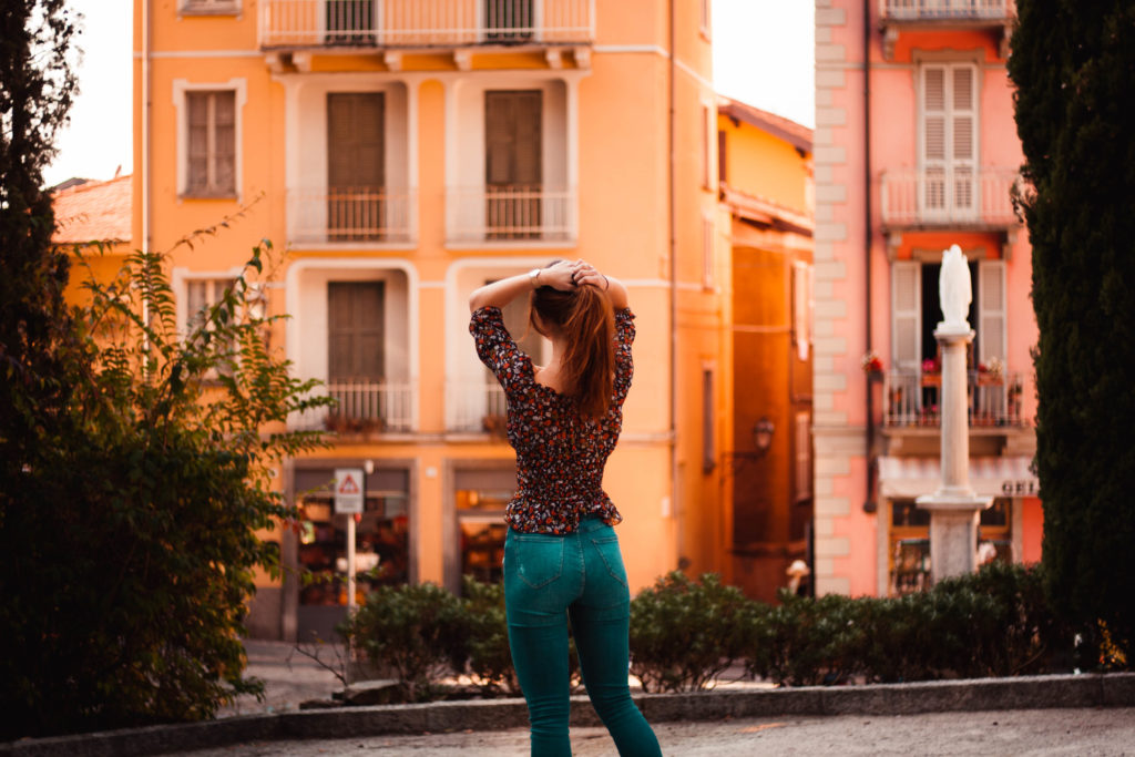
Anyway, whilst I love the look of cool, fresh photos, I know it just never works with my skin. On ladies with darker skin I love the tones and it looks so rich and lovely, but on me, anything cool just washes me out and makes me look like a bloody apparition. This gal does not need help looking any paler, seriously. Food also looks way tastier with warmer tones so y’know. That was one decision made – buh bye, cool tones!
Many people recommend finding subject matter that you can stick to, so choosing a few consistent things in your life and posting just those. Well, as someone who studies from home, but travels reasonably often… is sometimes in cities, and sometimes up a hill… this was pretty difficult. Might be bright blue skies one week and moody city shots the next, who knows. I have photos from test shoots with other photographers with their own styles to post too. Choosing all light or all dark images wasn’t gonna work, so that idea was out the window.
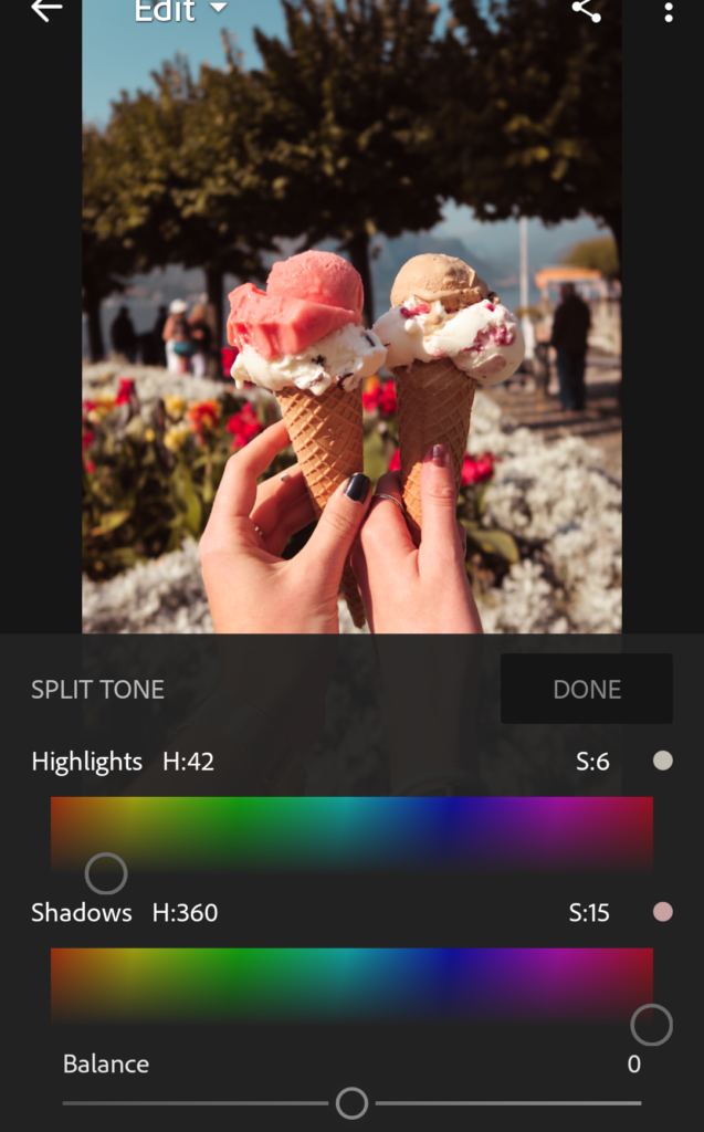
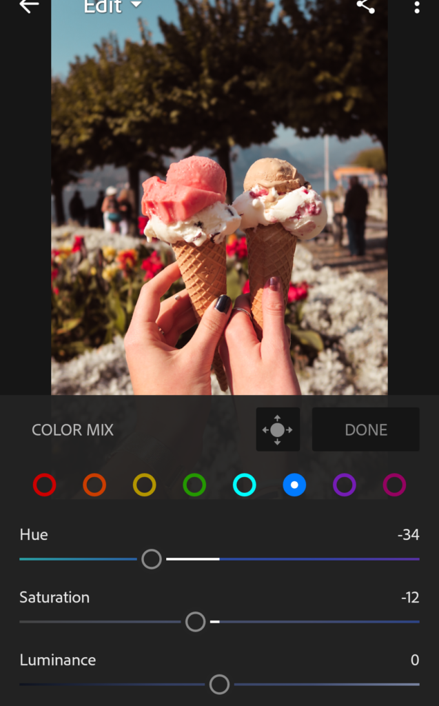
I’ve watched a hell of a lot of videos on Lightroom editing tutorials of all different styles (portraits, landscapes, cities, you name it), and the common theme was that the split toning is where you make a photo your own. The split toning is the ‘thing’ that makes your photos recognisable. Soooo, I experimented with many different colours and finally found shades that seem to work for every photo. Seems to be working for me so far! One thing I will always have is my skin tone and brown hair, so I’ve created a preset that will always work with this and bring out those colours in every photo. Dark red shadows and creamy highlights are what I’ve gone for, in addition to tweaking the hues and curves. I shift the greens way down towards yellow and desaturate (I’ve taken a particular dislike towards greens lately lol), boost the reds a little, shift the blues towards teal, and the yellows towards orange in case I’m looking a bit jaundiced.
Here are a few screenshots of a couple of the changes I make, so you get the idea:

This all sounds a bit faffy, but I genuinely enjoy playing around in Lightroom and once you’re used to it, Lightroom is just as quick and easy as VSCO or Snapseed anyway (and can obviously be used on a laptop, too). I was getting irritated with VSCO making my photos look dull so despite it being the blogger holy grail, I sacked it, and I’m far happier with how my photos look atm. Recently I changed my blog design slightly to feature those neutral warm colours too (you might have noticed the beige top bar and whatnot), and I’m working on doing the same to my media kit to bring it all together. I’ve been watching videos on colour psychology and finding this whole topic really interesting atm, so if you have any advice or thoughts, send ’em my way!
lily kate x
follow me on bloglovin | twitter | instagram | youtube | facebook | linkedIn | email me
1 Comment
Lucy
1st November 2017 at 10:02 pm…there’s a FREE Lightroom app?! Oh my goodness, this is a life changer!! Now all I need to do is buy some decent photography equipment (otherwise known as cameras ahaha) xxx
Lucy @ La Lingua | Life, Travel, Italy